
Vikasa is an open-source transportation data fabric that is transforming how signals, sensors, and information is connected and shared. This framework is the first of its kind in the industry, and the client had a vision for an unexpected, creatively disruptive brand. The name comes from a Sanskrit word that means transformation, and the client shared key adjectives such as groovy, retro, innovative, and nurturing.
Work was completed while employed at Sagetopia.
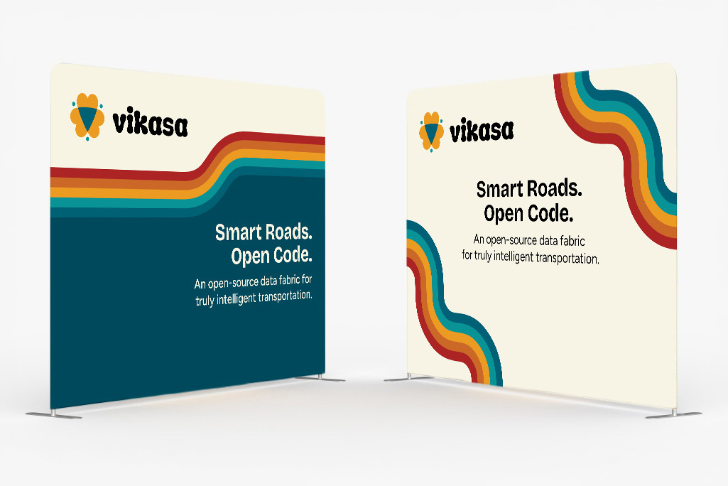
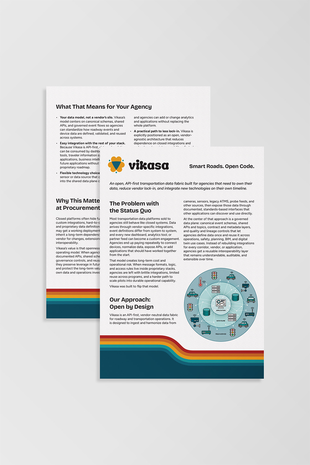
The client wanted Vikasa to stand out in an industry full of minimal, monochromatic branding, so I translated their vision into a visual identity that combines warmth and creativity with bold type and colors. The goal was to balance personality with professionalism so the brand would stand out yet remain credible.
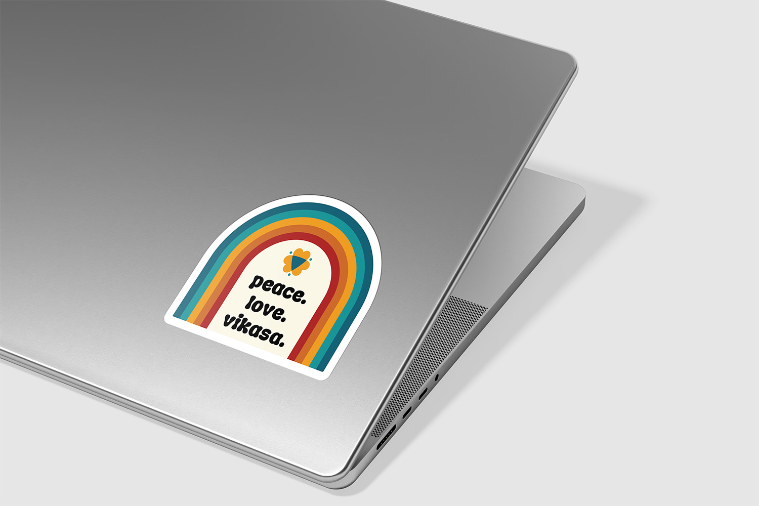
I chose retro colors and added black for contrast and anchoring. The colorful stripes bring to mind transportation highways, and the playful typography adds a sense of nostalgia.
The finished brand positions Vikasa as an innovative technology company doing things their own way and inviting like-minded individuals to come along for the journey. The logo features three overlapping hearts forming a downward facing triangle which represents feminine energy, along with dots around the mark that suggests a mandala.
The logo works with the website and other touchpoints to create a cohesive brand experience and strengthen the brand story of innovative technology balanced with a return to humanity that connects with Vikasa's audience.
The client loved the final brand, calling it "super fly" and "so fetch."
Send me a message and we'll see if it's a good fit.
